Dynamic screen
Are you remember a vh unit in CSS?
I remember, and for today I thinked that this unit is uniqe. But... I found that there is a svh and lvh units too. Oh, and the dvh unit too.
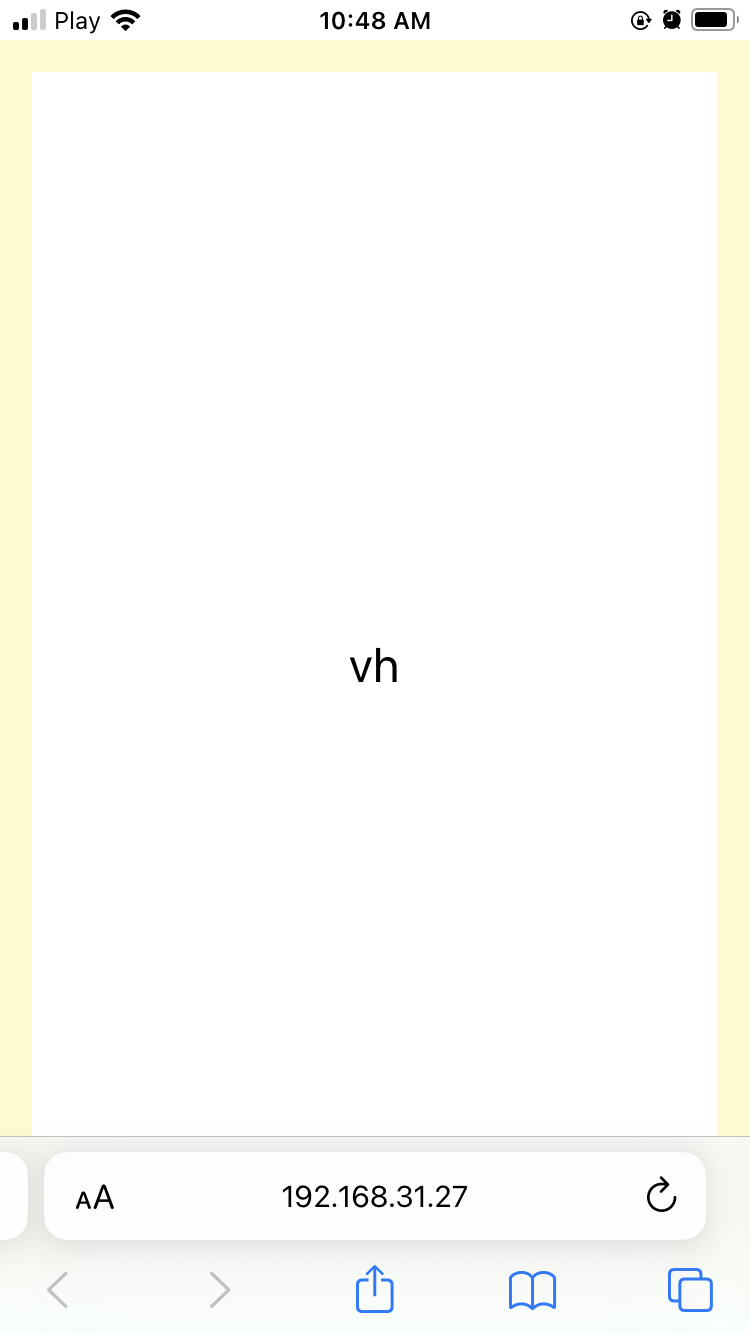
What is the vh unit?
It's a full heigh of your device screen.
For example, if you have a 1080p screen, the 100vh unit will be 1080px.
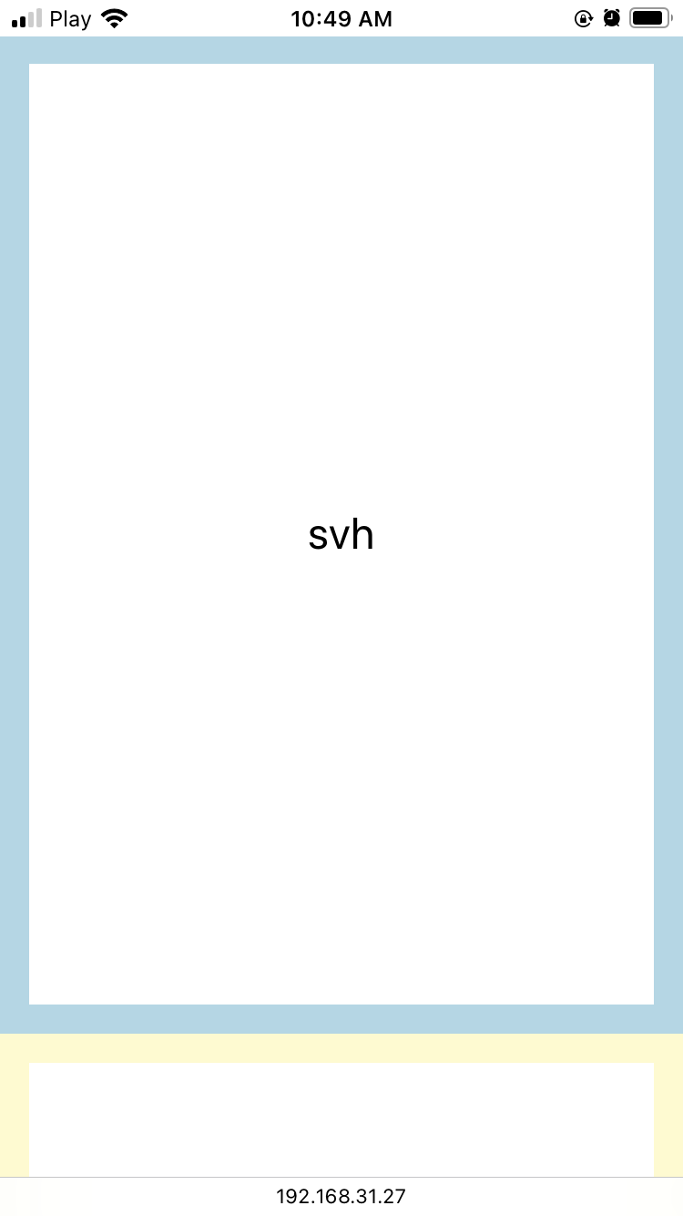
Svh and Lvh
That's useful for mobile browsers. Because the browser UI is overlaping page if use vh unit.
As you can see, yellow border is under the UI.
The svh(small viewport) unit fills a full screen, but hold free space for the address bar.
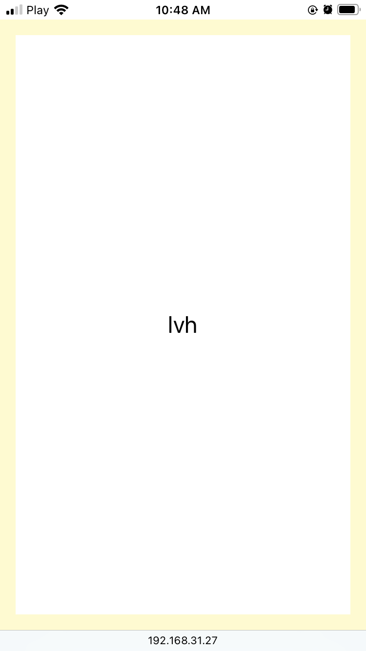
The lvh(large viewport) unit it's the same, but without the address bar.
Dvh (greatest)
The dvh(dynamic viewport) unit it's automatically conforms. If short, your screen will always be filled with 100% regardless of browser UI.
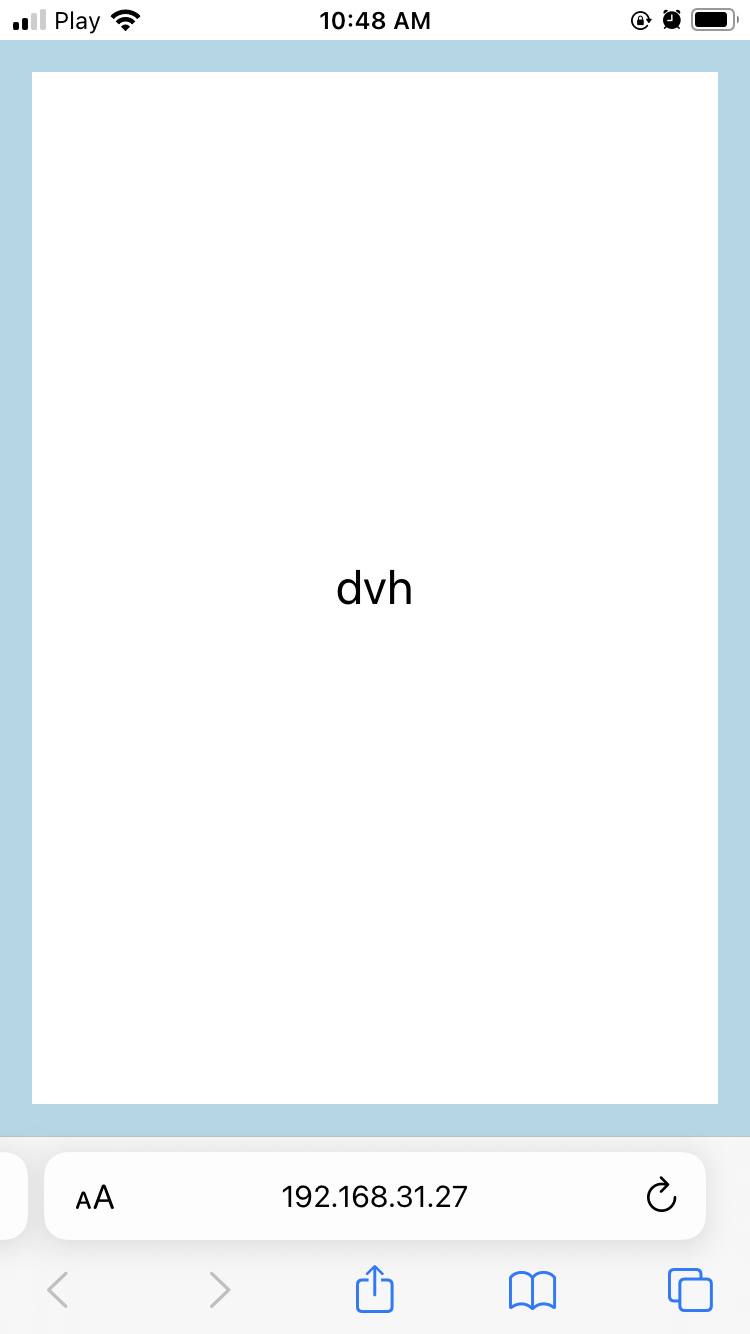
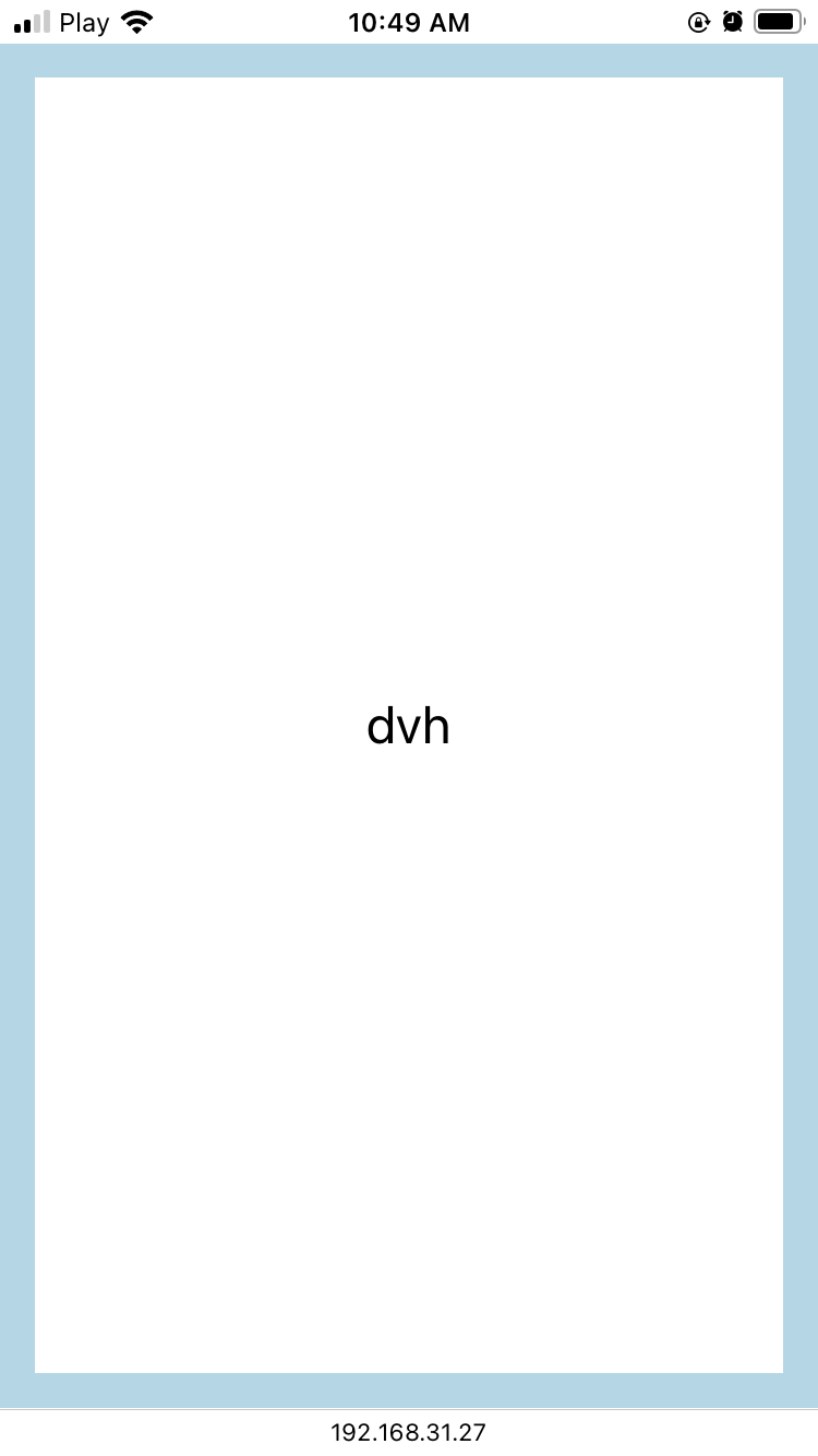
You see, that border is always on the top of the screen.
Conclusion
It's interesting, I found a new super responsive dvh unit. For mobile-first developing, it's a good thing to use insted of the vh unit.
March 14, 2023
Go back